The New Yorker
Overview
The Challenge
The New Yorker Hotel has a rich history rooted in 1930s New York and the elegance of the Art Deco era. The challenge was to reimagine the brand in a way that honored that heritage while creating an identity that felt distinctive and relevant today.
The Solution
I reimagined The New Yorker Hotel through an organic and elegant interpretation of Art Deco. Starting with a custom logotype, I established a creative direction that reconnects the brand with its 1930s heritage while giving it a fresh visual expression. Custom illustrations further extend the identity, creating a distinctive brand system inspired by the history and character of the hotel.
Contributors:
Skrocki Design Studio
Art Direction & Design: Kevin Skrocki Creative Director: Kevin Skrocki

Rooted in 1930s Art Deco
The existing identity felt too modern for a hotel rooted in 1930s New York. The redesign reconnects the brand to its Art Deco heritage, drawing on the era’s distinctive geometry, craftsmanship, and architectural character.

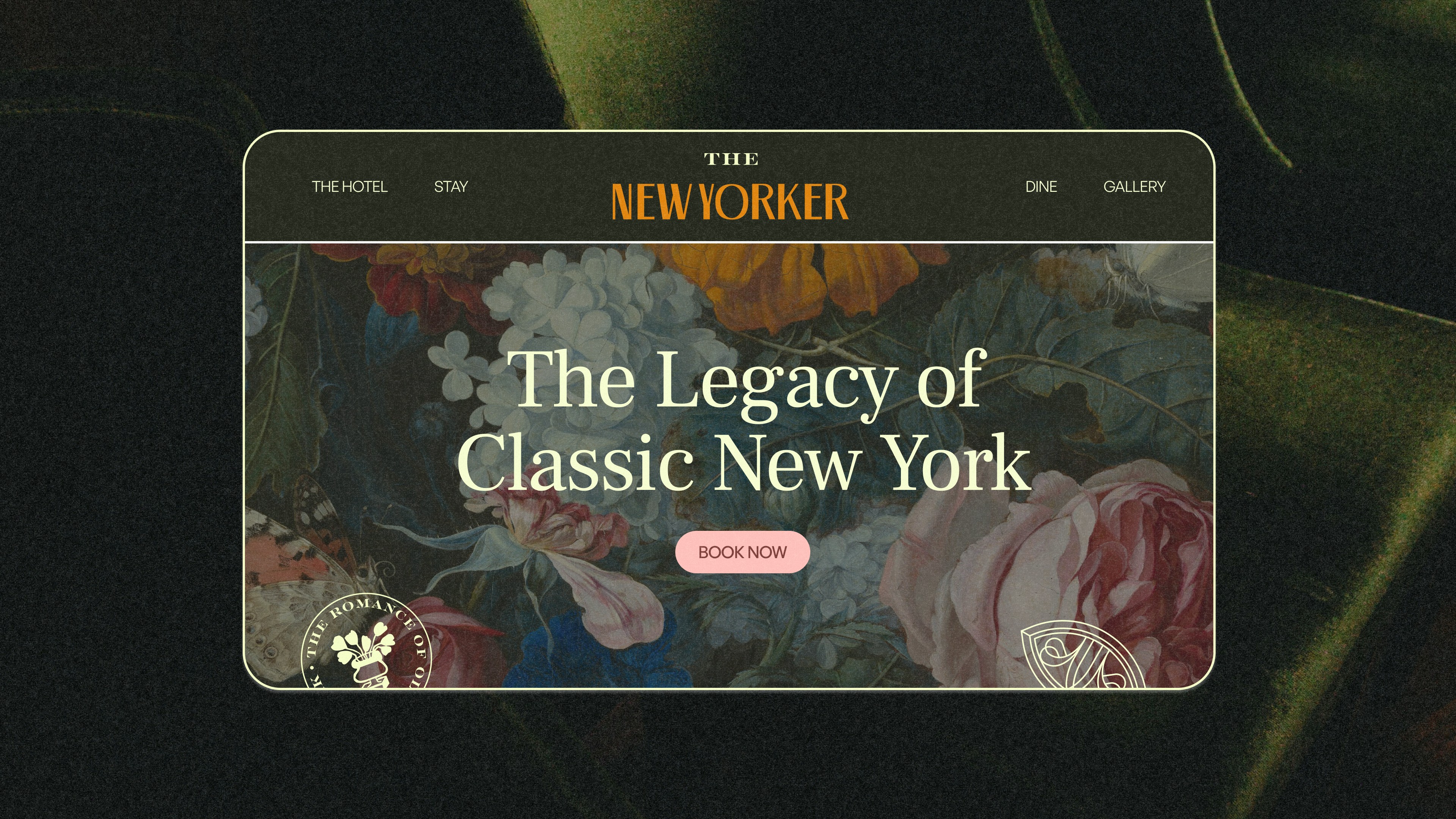

Crafting a Nostalgic Guest Experience
The identity brings back the nostalgia and lavishness of 1930s New York, creating a more personal guest experience. Grain textures and hand-drawn illustrations add warmth and character, giving the brand a sense of craftsmanship and individuality.

Designed Down to the Details
WThe custom lettering and logo marks were designed to feel native to the hotel’s 1930s origins. Paired with hand-drawn illustrations, they add a level of detail that carries through the identity, from the primary logo to the supporting brand elements.